
How to Use The Paint & Paper Library Colour Card
With a distinguished palette of 180 colours, the Paint & Paper Library colour card provides a shade for every interior and exterior scheme. From the subtle graduations of the Architectural Colours to the unique, characterful hues of the Original Colours, the collection can be utilised in both classic and contemporary interiors.
The Paint & Paper Library colour card has been designed to facilitate intuitive colour combinations; its simple yet highly effective layout is incredibly easy to navigate.
Within each section of the colour card, individual scales of coordinating colours have been clearly demarcated. Each column comprises an Architectural family and four distinctive Original Colours that can be used in combination.
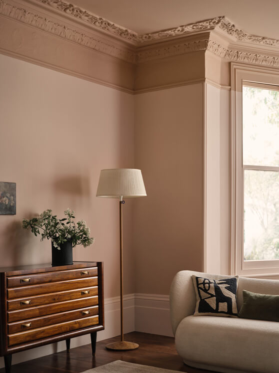
Pair the elegant warm pink, Ruse, with the deeper and richer Soumak for a softly contrasting scheme, and incorporate the Plaster family as complementary, pink-based neutrals. Or consider teaming the warm and alluring Cashmere shades with a sensational modern yellow such as Brimstone. Include accents of the traditional yellow, Pollen II, for added depth.
The Original Colours
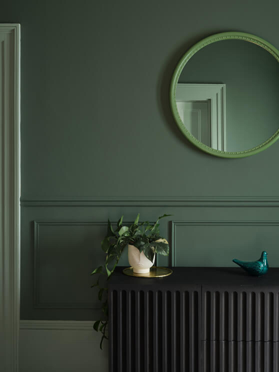
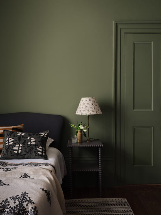
The Original Colours palette features 80 unique shades that have been designed either to stand alone and deliver bold, impactful interiors, or work in combination to create strongly contrasting and contemporary designs.
Explore the latest additions to the Original Colours palette.

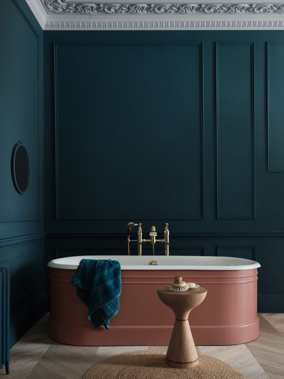
Nori is a blackened teal that creates a strong contrast with the playful peach, Roben’s Honour.
Iguana is a chameleonesque Cayman blue that can be used alongside Cotton II for a mesmerising living space.
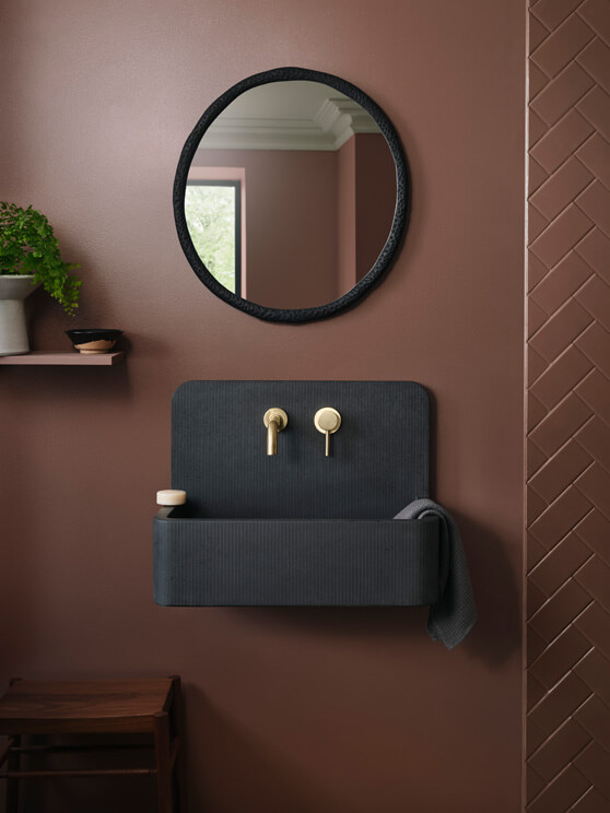
Mchanga is a red-earth shade found in the river sands of Tanzania.
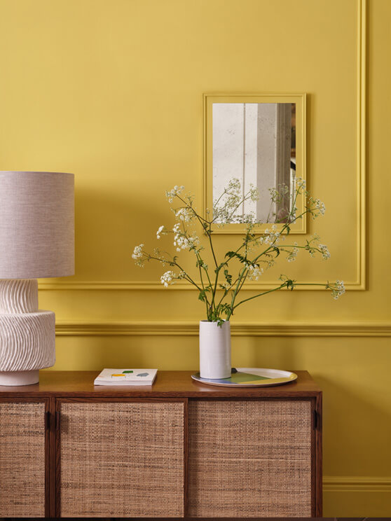
Brimstone is a contemporary mid-strength yellow that creates a joyful entrance alongside Salt and Clean White.
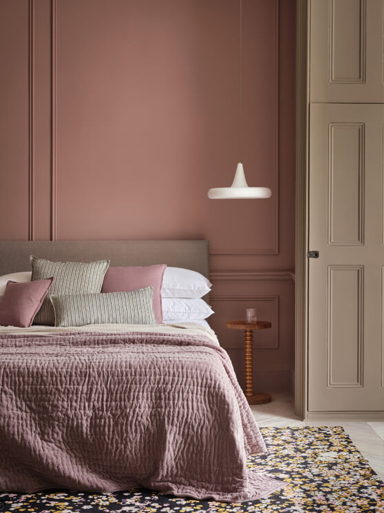
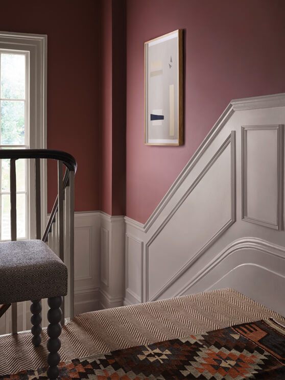
Ruse is a sophisticated diluted rose colour that pairs with Topi and Stone for a comforting bedroom scheme.
Mockingbird is a fabulous profound soft blue that creates a compelling contrast with the sultry pink, Kasbah.
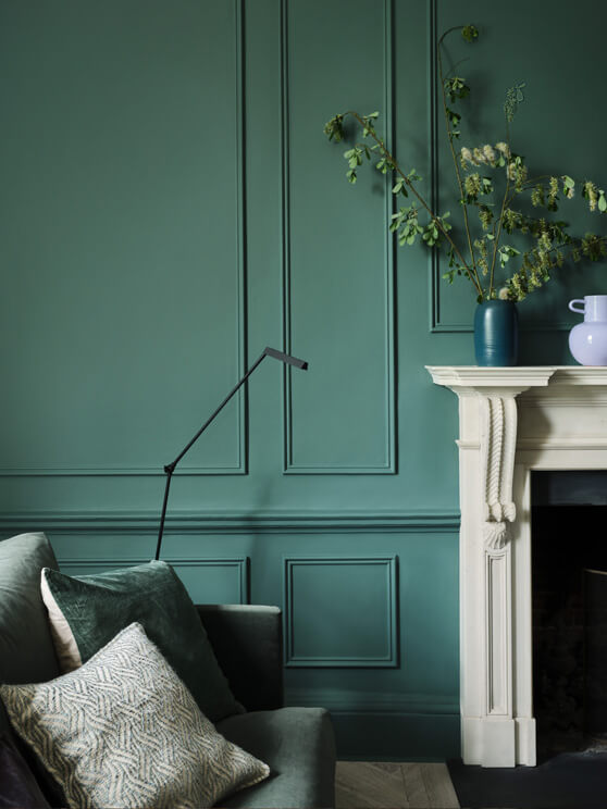
Fynbos is a bold yet restful hue ideal for a harmonious hallway that evokes nature.
The Architectural Colours
The Architectural Colours presents 95 shades grouped in families of graduated strengths of the same pigment. The palette includes versatile off-whites, warm neutrals, and cooler hues that harmonise beautifully with the Original Colours for effortless tonal schemes.
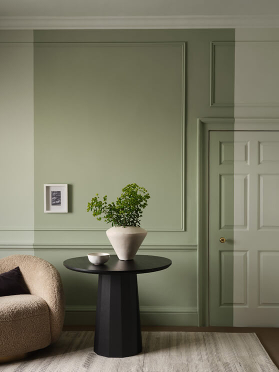
Powder is a delicate shade with discreet warm pink undertones, whilst Sprig is a tranquil, versatile green that offers a smart alternative to traditional neutrals. The ultimate neutral, Cashmere provides a gentle yet alluring warmth and a restful ambience.
Using the Architectural Colours in combination will create a coordinated scheme, whilst combining the deepest hue with the palest will deliver a more dramatic tonal finish.
The range of finishes from Paint & Paper Library
Alongside the distinguished colour palette, Paint & Paper Library offer a range of water-based finishes which are featured on the colour card. The cutting-edge, self-priming and multi-surface adhesion formulations in the Architects’ range of finishes can be used on virtually any surface, inside and outside, without the need for a separate primer. A single tin of paint can be used to paint walls, ceilings, woodwork, and more, offering the opportunity to embrace colour across every surface.
“This collection will transform how we decorate, allowing designers and homeowners alike complete control of where and how they use colour. The self-priming and durable nature of these formulations means our entire range of colours can be used on virtually any surface. Those motivated by the beautiful interplay of light on a matt surface, can use Architects’ Matt Emulsion across walls, woodwork, radiators and tiles. This stunning matt finish is as effective and hardwearing on woodwork as a conventional, higher sheen paint. The range of finishes, from the chalky ‘Pure Flat’ matt to the higher sheen Architects’ Satinwood and now water-based gloss, offers the opportunity to really play with sheen levels and their effect on colour.”
– Andy Greenall, Head of Design - Paint & Paper Library.