
Order a colour card
Featuring a distinguished palette of 195 colours, the Paint & Paper Library colour card is the ideal decorating tool for interior designers and homeowners alike. Order a complimentary colour card to explore the Original and Architectural Colours and discover unique colour combinations for your upcoming project.
The Paint & Paper Library colour card
The colour card presents the full range of colours in the current Paint & Paper Library palette. This includes the Original Colours and Architectural Colours collections, which have been designed to work in combination.
From left to right, the colour card ranges chromatically from monochromatic hues through to warm, neutral, and cool tones.
The Architectural Colours
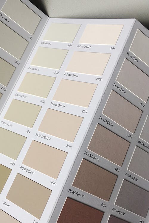
The Architectural Colours can be found in the top five rows of the colour card, from Cotton I to Lead V. A colour-by-number system, the Architectural Colours enable you to create harmonious tonal schemes using close tones of off-white and neutral colours.
Each colour within an Architectural family uses different strengths of the same pigment and is numbered I, II, III, IV and V according to its tonal weight. For example, Stone I is a pale neutral, Stone III is a mid-strength, warm and versatile shade, and Stone V is a darker hue, which can be incorporated as an accent for added depth.
The Architectural Colours palette moves chromatically across the colour card, from monochromatic, to warm, neutral and cool. Cotton and Slate are grey-based colour families, while Powder, Plaster, Marble, Salt and Leather include warm pink or lilac pigments. Wattle, Willow and Sprig have green undertones for a more natural scheme, and Steel, Porcelain and Lead achieve a cool and contemporary, blue-based design.
Five versatile white shades complete the palette: Clean White, Fuji, Capuchin, Chaste, Paarl.
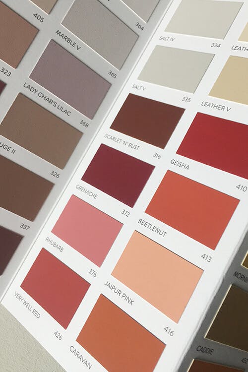
The Original Colours
Found in the bottom four rows of the colour card, the Original Colours present a colour with personality for every interior style. From the deep and mysterious Tallanstown Grey to the popular charcoal blue, Squid Ink, the Original Colours have been inspired by historical, traditional and contemporary interiors from worldwide sources.
The Original Colours have been grouped into sets of four and paired with a complementary Architectural family, based on their shared undertones. By combining Original Colours with Architectural Colours, you can design harmonious schemes within and between rooms.
This layout has been designed to provide inspiring colour pairing recommendations, meaning you can design a scheme with confidence. Alternatively, you can creatively combine Original Colours and Architectural Colours from across the colour card to achieve a compelling contrast.

Choosing Colour
Every swatch on the colour card has been painted with real paint, using the soft, matt and chalky finish, Pure Flat Emulsion. You can have confidence that every shade is an exact representation of how the colour will appear on the wall, reacting to light in the same way.
Once you have selected your chosen shades, order sample pots and test them in situ throughout the day to confirm your colour choices.

Advice for Choosing Colour
