Colour Zoning: Creating Open-Plan Colour Schemes
Many contemporary properties feature open-plan layouts, with one room taking on multiple functions throughout the day and evening. This change has placed a new importance on ‘colour zoning’. Colour zoning open-plan rooms is the act of using colour to create different areas within a space. As a result, each area will have its own function.
Colour zoning is a great way to bring structure to your open-plan living space. Carried out effectively, this method of decorating can create a harmonious interior with a clear sense of purpose and flow.
Explore open-plan painting ideas using the Paint & Paper Library palette to decorate your space and elevate your home…
How to create zones in open-plan living with paint

1. Use the Architectural Colours for a coordinated scheme
One of the simplest ways to segment your space is by choosing a selection of related colours to paint different elements of the room. By using colours that naturally coordinate with one another, you can introduce colour accents. These accents allow you to create focal points without detracting from the room’s overall integrity.

The Paint & Paper Library colour card presents groups of Architectural Colours alongside their complementary Original Colours. This layout enables you to combine shades in each column with confidence.
In this scheme, the Paper Architectural Colours feature on the walls and woodwork, while stronger, complementary yellows provide focal points on the ceiling and adjoining hallway. Consider using Muga and Morning Room from the Original Colours palette.
Discover more ways to use the Architectural Colours in your interior scheme.

2. Add drama with a light-to-dark transition
Colour zoning offers the opportunity to make a stronger design statement and bring a touch of drama to your scheme. Contrasting a light shade with a darker colour instantly creates a strong, definite separation between the two spaces.

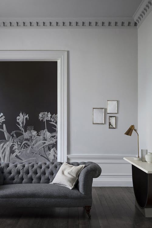
A deep, sumptuous paint colour or a dark wallpaper colourway will completely alter the mood and atmosphere. Transition from a hallway painted in Lead V to a reception room in the inky deep blue, Squid Ink. Together, these shades will deliver an enveloping, moody setting. Or consider introducing dark and impactful Aloe Walk – Perse Grey wallpaper alongside the soft grey Cotton Architectural Colours.
Explore inspiring ways to combine light and dark colours in an open plan home.

3. Juxtapose two contrasting colours for added design interest
If you’re looking to create impact with a more vibrant colour palette, consider using two contrasting shades. Combining contrasting shades from our Original Colours offers an excellent option. By introducing an unexpected colour on one wall, or in an adjoining room, you will create an intriguing colour journey throughout your space. Painting open plan rooms in contrasting colours will also achieve a captivating finish.

It’s important to consider the look and feel that you want each space to have, before choosing colours to reflect this. You could create a rich and intimate study space by painting walls in the deep sea-green, Nori. Then for a bright uplift, introduce the playful peach-pink, Roben’s Honour, in your hallway. A bright contrast can also help to maximise natural light in a multi-functional space.
Or you could keep the mood quite similar, using sophisticated hues such as Muga and Hunter Dunn. This combination will create two zones in one open-plan living room or reception space.

4. Introduce bold colours to bring personality to your kitchen-dining scheme
One of the most popular open-plan settings is a kitchen-dining scheme. These spacious rooms are often full of energy and activity. As such, they are fantastic places to introduce brighter, bolder colours in the areas where you want your guests to gather round.
Allow your dining area to take centre stage, using the bright and attractive yellow, Chinese Emperor. This warm yellow shade is perfect for creating a welcoming, sociable setting. Consider painting functional parts of the room, like kitchen cabinetry, in the elegant dark purple-brown, Copper Beech. This approach will seamlessly blend functional areas into the background.
Blue Pearl and Temple is another inviting colour combination that exudes personality and interest in kitchen-dining schemes.

5. Utilise colour blocking to define one area
Colour zoning does not necessarily mean introducing a different colour on one whole wall. Colour blocking is an excellent alternative to define a new space in a more subtle way, by using colour in smaller proportions. This method works particularly well in work-from-home spaces, which are often very small parts of much larger, open-plan rooms.
Adding a colour accent to the wall behind your desk will instil a clear sense of focus into that part of the room. Consider a contemporary monochromatic look with the complementary, blue-based white and black shades, Flat Light and Beyond Blue.
Once you've determined the best method to zone your open-plan space, browse the Paint & Paper Library colour palette online. You can also order a complimentary colour card to assist with your open-plan colour scheme selection.
