
2023 Inspiration: Incorporating Colour & Design Trends
The Paint & Paper Library colour card offers a vast array of colours to suit any interior style. This eclectic palette is the ideal place to find colours that will enhance and update any space for the year ahead. From using classic neutrals to bolder more contemporary hues, discover the latest design inspiration from Paint & Paper Library.
Interior colour trend: warm tones
For several years, cool, blue-toned greys saw sustained popularity as a way to harness a contemporary aesthetic. However, more recently, there has been a definite shift toward using warmer tones. This change responds to a longing to be surrounded with comforting, soothing colours. Whether you choose neutrals or more vibrant hues, warm shades provide a sense of serenity in home environments.

Create timeless interiors with warm neutrals
Warm and earthy neutrals stand the test of time. These shades are extremely versatile and easy to use in both traditional and contemporary settings. Consider a tonal palette of warm neutrals to create a soft, pared-back design, or pair them with bolder colours for added impact.
The delicate Powder is presented in five graduated shades which are numbered according to their tonal weight. Its soft pink undertone provides elegant warmth, making it the perfect neutral for a large living space. Combine Powder I, III and V on walls, woodwork and ceiling for an enveloping tonal scheme.
Walls: Powder V, Powder III
Ceiling: Powder V
Skirting: Powder I
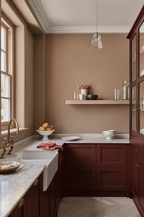
Mink contains gentle pink notes for added warmth. Mink on walls teams beautifully with the deep, enigmatic shade, Scarlet ‘n’ Rust, on cabinetry. Contrast this colour pairing with marble work surfaces for a luxurious kitchen scheme.
Walls: Mink
Cabinets: Scarlet 'n' Rust
Ceiling: Clean White
Discover the neutral paint colour palette
Introduce statement shades for a bolder look
Using strong pinks, burnt oranges and reds is a fabulous way to add instant impact whilst retaining the comforting effect of warm tones.
Caravan is an exciting Moroccan red that works well alongside monochromatic accessories and botanical elements. For a truly captivating look, combine matt and high gloss finishes in a bold geometric design.
Walls: Caravan
Ceiling: Tablecloth
Window: Lead II

For vibrancy, consider using strong oranges and pinks in striking combination. The burnt orange, The Long Room, pairs with Roben’s Honour on kitchen cabinetry for a lively and unexpected colour combination.
Walls: The Long Room
Cabinets: Roben's Honour
Ceiling: Paper I
Windows: New Black
Browse the red and pink paletteEmerging design trends
Alongside the colour trends for 2023, there are a number of design trends to add interest and impact to interiors.

Paint the ceiling in a statement shade
Ceiling colour has a big impact on how a room will feel. Instead of painting the ceiling white out of habit, choose a complementary neutral for a softer finish or opt for an all-over shade for an encompassed look. Alternatively, select a contrasting shade to draw the eye upwards towards architectural features and create a statement in the space.
Jaipur Pink pairs with the sultry Kasbah on the ceiling for a stylish and sophisticated living room. Consider using the ceiling shade on the skirtings to frame the room and give a more cohesive finish.
Walls: Jaipur Pink
Ceiling/Cornicing & Skirting: Kasbah
Fireplace: Salt III


Utilise colour blocking for added design interest
Colour blocking is a great way to introduce stronger colours into neutral schemes. Use a deep shade alongside a paler, complementary hue to draw out the undertones. This type of colour pairing can also help to create the illusion of architectural features.
Use shades from one Architectural family for a balanced tonal scheme. Here, Sprig V accompanies Sprig III and Sprig I in a contemporary, asymmetrical design.
Walls: Sprig III, Sprig V, Sprig I
Ceiling: Sprig I


Create a bold colour drenching scheme using one strong colour
Colour drenching sees a single colour carried across walls and woodwork for a cohesive, enveloping feel.
Shades inspired by the natural world have an inherent sense of calm and tranquility. Create a dramatic effect by using a strong yet restful blue or green across walls and woodwork, embracing guests in their rich pigmentation. Consider the striking green-blue, Iguana, or vivid deep blue, Blue Blood, to instil an enveloping peaceful quality.
Walls: Iguana
Ceilings/Cornicing: Cotton II

Walls, Door & Trims: Blue Blood
Create a tranquil atmosphere with greens and bluesRequest a colour card to discover the complete colour palette.


