
Paint colours for your 2024 living space
With a new year comes the opportunity to consider different ways to update your living space that add lasting character to your home. The Paint & Paper Library colour card comprises a palette of unique shades to use with confidence in all-over schemes, or in combination with complementary colours.
Explore recommended colour palettes for your 2024 projects to create beautiful interiors with real longevity…
Warm and earthy neutrals

Neutrals are a proven staple in interior design, with an ability to provide a harmonious backdrop that coordinates effortlessly with furniture, artwork and soft furnishings. Recent years have seen a clear shift away from cooler tones towards warmer, earthier shades, often based on natural pigments. These soothing hues sit comfortably in almost any interior setting – hallways, living rooms, kitchens, bathrooms, bedrooms and home studies – creating a sense of connection with the natural environment.
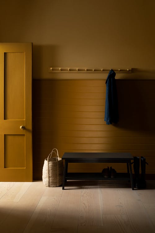
Walls: Truffle
Ceiling: Glass IV
Door/Trim: Sand III

Embrace warm and earthy neutrals all-over to create a calm and restful, encompassing scheme. In the Paint & Paper Library palette, these shades can be found in the Architectural Colours – such as Stone V, Canvas V and Powder V – and in the Original Colours – for example, Truffle and Thames Mud. You can pair more confident neutrals with softer, complementary tones from the Architectural Colours to benefit from an element of tonal contrast, as demonstrated in this serene living space that combines Powder V with Powder III and Powder I.
Walls: Powder V & Powder III
Ceiling: Powder V
Skirting: Powder I


Alluring honey hues
Paint colours with a strong yellow or orange undertone exude warmth and comfort. These golden and honey-coloured shades are perfect for spaces where you want to create an alluring ambience. Caddie is an excellent colour for a cocooning bedroom or living space, working well with richly coloured soft furnishings to bring wraparound warmth. Or for a more understated scheme, use Caddie or Muga on panelling to accompany a softer, complementary shade on the walls.


Soothing brownish pinks
For an alternative, consider brownish pinks such as Mink, Temple and Powder to provide an effortless warm backdrop for your living space. These dusky shades are incredibly easy to use, a popular choice with designers and homeowners alike. They also offer a simple way to introduce bolder tones that add instant design interest to a scheme. Combine Temple with an elegant deep purple-grey such as Monument for a classic pairing. Or pair soft Mink walls with cabinetry in the sumptuous deep red, Scarlet ‘n’ Rust, to bring richness and depth.


Rich chocolate browns

For an elevated neutral scheme, choose deep and sumptuous browns such as Charbone. Despite associations with practical or dated interiors, rich chocolate browns work beautifully in living spaces, as an accompaniment to natural woods, stone finishes and linens.
Ceiling: Capuchin
Wall: Charbone
Doors: Charbone
Highlight Block: Thames Mud

With their earthy undertones, they can be embraced across walls and woodwork to create a soothing and nurturing atmosphere. Consider a brown with an enticing aubergine hue, such as Copper Beech, to add a sense of opulence to your scheme.
Walls: Copper Beech
Trim: Canvas II


Resonant greens

To draw nature inside your living space, consider rich deep greens that contain yellow undertones, such as Apple Smiles II. The touch of yellow will bring brightness, warmth and vibrancy, as well as an innate earthy feel, making it an ideal colour to use generously across all four walls.
Walls: Apple Smiles II
Ceiling: Hunter Dunn
Trim: Wattle II

For a slightly softer, earthy green, The Botanist is formulated using yellow ochre to produce a shade with a relaxed, tranquil character. Alternatively, a strong yet muted green like Sencha will pair beautifully with a rich and warm yellow highlight of Pollen II on the ceiling.
Walls: Sencha
Cornicing: Pollen II


Confident mid blues
A timeless shade revered for its calming abilities, blue paint colours range from sumptuous deep, inky blues like Kigali and Plimsoll to cooling pale blues such as Steel and Lead. For a scheme with equal confidence and longevity, consider the palette of mid-strength blues from Paint & Paper Library.


Resonant blues with a touch of vibrancy, such as Blue’s Blue or Blue Gum, can feel either traditional or contemporary depending on the colours and accessories with which they are paired. Whilst muted shades like Blue Vein and Bluebird are reminiscent of classic Wedgwood blues, promoting a tranquil, restful atmosphere.
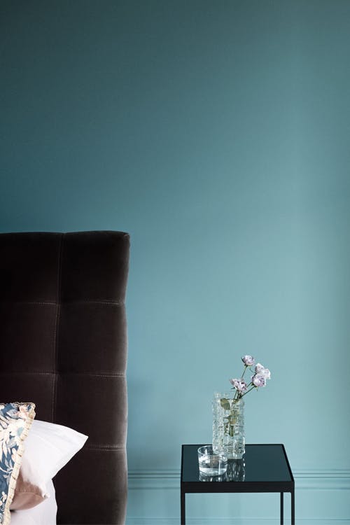
Wall: Blue Vein
Woodwork: Porcelain II
Shelving: Porcelain IV
Countertop: Kigali


Playful pink-peach hues

For an elegant paint colour with gentle brightness, utilise pinks with peach undertones in your living space. The touch of orange in the formulation provides additional warmth, creating a soothing and uplifting setting. In the Paint & Paper Library palette, these colours range from dusky pink-peach hues, to shades with real vibrancy, such as the diluted terracotta, Jaipur Pink.
Walls: Jaipur Pink
Ceiling/Cornicing: Kasbah
Skirting: Kasbah
Fireplace: Salt III

While these shades can feel highly contemporary when paired with contrasting colours, they are often based on natural pigments, which gives them an appealing, earthy character. For example, Roben’s Honour is an ancient colour originally made with flake white and red ochre. It can pair with the strong burnt orange, The Long Room, for a scheme with real personality, or it can accompany the Powder neutrals for a more understated tonal scheme.
Walls: The Long Room
Cabinets: Roben’s Honour

A muted peach, Desert Rose is reminiscent of natural plaster. It provides an excellent backdrop to bolder colours such as Beetlenut for a contemporary space, or Plum Brandy and Rouge II for an inviting, classic pairing.
Upper Wall: Plaster V
Panelling: Beetlenut
Side table: Grenache


